Flodesk Review: Why We Switched Our Email Marketing from Mailchimp to Flodesk
Our Flodesk review covers why we think Flodesk is the best email marketing platform, why we switched from Mailchimp, the pros and cons of using Flodesk, and how to know if it’s the right platform for you.
We've talked about plenty of things on this blog before - travel, photography, and our love of sustainability to name a few.
One topic we've never really touched on here is blogging itself and all the intricacies that surround our business. It’s somewhat ironic, considering the ‘business of blogging' is what consumes 90% of our waking life!
But recently, we sent out our regular monthly newsletter, and received quite a few lovely comments back from our readers that they loved the design, and could we share which platform we'd used.
We were actually pretty chuffed, considering we had literally just switched our email marketing platform to Flodesk from Mailchimp, and this was the very first email we'd sent on the new system.
We fell in love with Flodesk and their powerful design-forward email system a while ago but were still nervous to press send for fear of 'breaking' our mailing list. Those responses confirmed we'd made the right choice, and have us feeling even more enthused about Flodesk!
Email marketing can feel daunting at times, but it definitely doesn't need to be if you have access to the right tools. We figured that there might be more of you out there searching for the perfect email platform for your business, which is where we hope this Flodesk review will be of use.
From why we switched from Mailchimp to the pros and cons of using Flodesk and how to know if it's the right platform for you, this is our Flodesk review.
OUR FLODESK EMAIL MARKETING REVIEW
WHY EMAIL MARKETING IS IMPORTANT (ESPECIALLY FOR BLOGGERS)
There are plenty of ways to drive traffic to your site: SEO (Search Engine Optimisation), Pinterest, Instagram, Facebook, to name a few. But how many allow you to communicate directly with your audience on a highly personalised level?
Building a strong, segmented email list and communicating with it frequently is vital for a few reasons. It allows you to:
Build a pool of highly-engaged readers of your site (they actively subscribed to your mailing list, after all)
Communicate key messages to your most engaged readers
Strengthen your relationship with those readers
Increase your traffic to your site
And what does more website traffic lead to? Increased audience engagement, more opportunities to convert readers, product purchases, affiliate and ad revenue, and generally more chance of business success overall.
In fact, studies have shown email is 40x more effective at customer acquisition than social media. 40 freakin' times!
Think of it this way: the gap between social media or your website and your email list is basically the difference between giving a lecture to a crowd of people who might be interested in what you're talking about... vs hosting a workshop with a few people who actively signed up to your class and are invested and eager to learn more.
WHAT IS FLODESK?
Flodesk was founded by two women — can we get a hoo-freakin'-ray for women-owned business, especially in the tech industry?! — who recognised the importance of email marketing, but saw the limited and costly email options available to the growing number of small online businesses.
That began a mission to bridge the gap between powerful email clients and slick email marketing and provide small businesses with the ability to create beautiful, high-converting emails - without huge budgets or design teams behind them.
The end result is Flodesk, an email marketing provider made for creatives by people who understand the industry, with a design-first approach, powerful automation, beautiful opt-ins and forms, and a super-simple interface.
FLODESK PRICING | HOW MUCH DOES FLODESK COST?
Flodesk's pricing model is probably its biggest selling point of all.
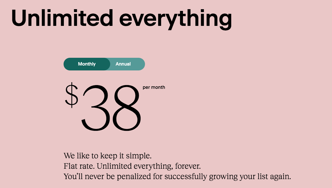
It's technically a flat rate of $38/month, BUT, you can get 50% off for your first year using our discount link here, bringing it down to $19/month.
That flat rate covers everything, from designs to list building, automation to building your forms, and doesn't change regardless of your audience size.
We've covered more about Flodesk's pricing and why this flat rate pricing is super important below — but basically, this is a gamechanger!
You also get a full month's free trial to get a feel for the platform and whether it suits your needs.
Get 50% off Flodesk for your first year + a 30-day free trial here
WHY WE SWITCHED TO FLODESK | MAILCHIMP VS FLODESK COMPARISON
WHY WE SWITCHED FROM MAILCHIMP
We know there are plenty of MailChimp lovers out there who find it an amazing tool for their business, and that’s great. We're just not those people.
We spent three years using Mailchimp for our business (and a couple before that in our previous careers), and n all that time, we never got a point of feeling comfortable using it, or like we were creating emails we were proud to press send on.
Every single time, we felt like we were battling a clunky interface, banging our head against the wall tweaking CSS customisations, or getting lost amongst its complex backend system. And frankly, the cost was getting a bit ridiculous. Some of our main frustrations were:
A clunky, slow, confusing interface that forever had us worried we'd send a half-finished draft out to our audience without realising
They just didn't look good - even when we hours ages tweaking CSS code and messing with layouts.
Segmenting and tagging our list was a pain (or impossible, for certain things)
Automation and form building aren't easy processes
They're super bloody expensive once you start building your list and begin moving up subscriber tiers
WHY WE SWITCHED TO FLODESK | FLODESK ADVANTAGES
FLODESK’S BEAUTIFUL DESIGN
As content creators and photographers, aesthetically-pleasing visuals are a vital part of our business. As everyday consumers, we're also suckers for a sleek-looking, creative email that stands out from the thousands that hit our inboxes each week.
Flodesk is all about good design — and good design that converts. Their tagline, after all, is 'design emails people love to open', which pretty much says it all.
Their templates are, quite simply, bloody beautiful. They're on-trend, intuitive, and simple to use. They're also customisable; you can load your brand fonts and colours and tailor blocks to your needs, and they often partner with leading content creators to create unique formats.
Unlike MailChimp, where major design changes involved custom CSS (or simply giving up), Flodesk's designs are a) already beautiful enough to not want to change much, and b) very simple to pull together.
And look, a pretty email isn't all that matters. Creative, engaging copy with clear calls to action is where it's at. But an email that's also easy on the eye goes good to brilliant instantly. Since switching over, our open rate has increased, our click-through rate is up, and we’ve also noticed a jump in our daily subscriber count too.
Plus anything that gets us excited to send out an email, knowing it’s on brand and represents the quality we try to always achieve with our work, is something to celebrate!
Our newsletters on Mailchimp….
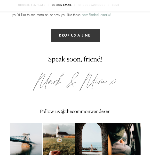
Vs. Our newsletter on Flodesk
SIMPLE, CLEAN INTERFACE AND USER EXPERIENCE
In our view, an email marketing platform’s interface should allow you to quickly and easily complete the business tasks you need to so you can get on with doing what you do best. In this instance, your list building, workflows, and ability to build or automate campaigns shouldn't be taking up more time than the actual content creation.
Flodesk sticks to the old adage of 'better to do a little well than a great deal badly'; they don't clutter what they do with a million functions you'll probably never use.
Basically:
The form builders are simple and intuitive.
Each step is clear and contains plenty of guidance (kind of like Flodesk are holding your hand)
The analytics are simple to read and easily navigable.
The template builders are predominantly drag-and-drop
There are no complicated customisations or CSS requirements.
Building workflows (aka automation) is simple
Segments are easily created, and there's no accidental double-tagging.
Instead of wasting time stressing, you can create impactful marketing campaigns with a snap of your fingers (okay, well slightly longer, but you get the point).
FLODESK’S ANALYTICS AND REPORTING
We initially hesitated on switching from MailChimp as their analytics is, admittedly, really strong.
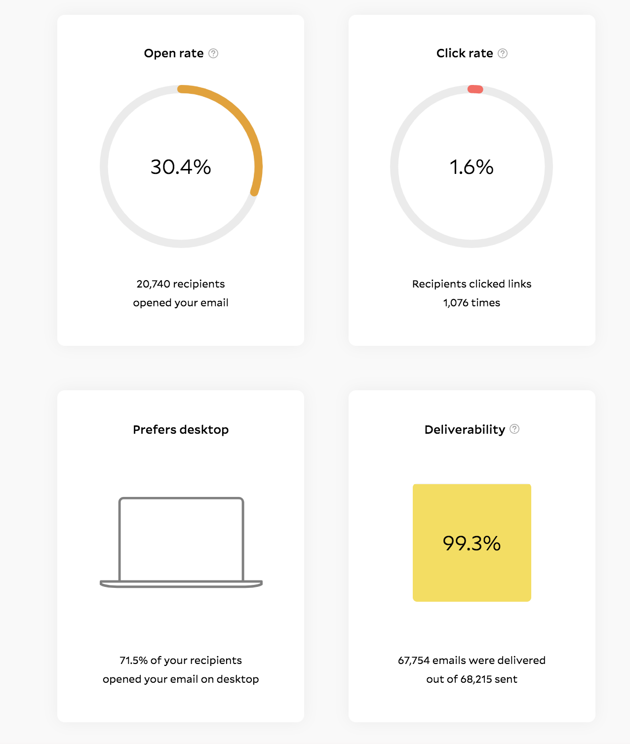
Turns out Flodesk's is just as good, and so much easier to read. You can view the 'story of your send' by clicking 'view stats' on the email campaign, which brings up a comprehensive overview of your email's performance. Every detail you need about your open rates, click-throughs, link performance, and deliverability is right there, in easily digestible format.
Flodesk's analytics panel indicates whether your audience is opening their email on desktop or mobile, which goes a long way to helping you format your emails for one or the other too. You can also opt to resend your email to those who haven't yet opened it if you wish.
Example of Flodesk’s analytics reporting. *not our stats!
Example of Flodesk’s analytics reporting. *not our stats!
IT’S SUPER COST EFFICIENT
Flodesk's pricing is absolutely insane for the value you get - especially if you use our 50% off Flodesk discount code (or type ‘THECOMMONWANDERER’ when you sign up) to secure it for $19 a month for a month for your first year.
After that, the pricing goes of $38/month stays the same whether you have 100 subscribers, 100,000, or 1,000,000, which is basically unheard of when it comes to email marketing platforms.
Other platforms tend to start off free or relatively cheap when you have a small subscriber list and then jump into the hundreds per month once your list grows more than 5-10,000 subs.
Flodesk's flat pricing model means you can build your subscriber list (aka your world domination empire) without having to worry about whether you're approaching a limit and therefore going to have to either to delete people off your list or opt for an expensive account upgrade to keep them there.
IT’S WAY MORE TIME EFFICIENT
We're a two-person business, which basically means wearing many hats and stretching ourselves super thin across everything we do.
Bluntly, we don't have spare time — nor a big marketing and design team behind us — to f*ck around with complex interfaces, designing new visual assets and the like. Flodesk does a lot of the legwork for us, so we can worry about what actually goes into our emails instead.
FLODESK'S CUSTOMER SUPPORT IS GREAT
Thankfully we didn't run into any real issues when switching email platforms, but that's also because Flodesk's support is really good. It actually reminds us of Squarespace (our website host/platform), and their customer support system that's saved our butts a few times now.
There's a really good Flodesk Help Center with plenty of guided tutorials and troubleshooting walk-throughs if you run into any issues, plus their customer service is reachable via email. There’s also an active Flodesk Insiders Facebook group where you can interact with fellow online biz owners and the Flodesk customer service team pretty quickly.
CONS OF USING FLODESK
Of course, every platform ever comes with both pros and cons for use, no matter what industry or service they're providing (or how great their designs might look!).
These are a few of the disadvantages we’ve found when using Flodesk:
SOME CUSTOMISATION LIMITATIONS
When we first built our email template, fitting our content to Flodesk’s template blocks (rather than the other way around) took some getting used to.
For example, we wanted to align two images side-by-side, with linkable text blocks or a button below each and discovered that we couldn’t drag and drop the blocks next to each other. We did eventually find a workable solution, but it basically took us realising we needed to fit our content to their templates, rather than the other way around.
If you have very specific or unique customisation requirements, you might want to play with Flodesk’s free trial before officially migrating over.
THERE’S NO NATIVE E-COMMERCE INTEGRATION FOR SQUARESPACE
This might be a sticking point for those of you looking for automated commerce email communications: Flodesk doesn't currently have a native integration with e-commerce on Squarespace or WooCommerce. Same goes for Teachable. It does integrate with Shopify.
If your business requires e-commerce comms automation (for example, when a client purchases from your online shop and receives an automated email), you'll need to connect Flodesk to your Commerce or Business Squarespace plan via a third party like Zapier.
That said, we sell digital products on Squarespace (watch this space for some physical products being released soon too...!) and this hasn't been an issue for us so far, especially as MailChimp was the same scenario. We use Squarespace's own commerce communications for that and provide the option to sign up to our Flodesk email list upon checkout.
IS FLODESK RIGHT FOR YOU?
Of course, our Flodesk review is all about how useful we've found Flodesk for our own business - your own might be really different.
If you're considering switching over yourself, there are a few questions to ask yourself before you can work out whether Flodesk (or any other email marketing platform for that matter) is the right business tool for you:
What website platform do you currently use, and are they compatible?
Do you have native and/or third-party integrations?
Your technical skill level
Your budget
What type and style of email campaigns do you want/need
Can you integrate your branding, social media, and assets in a way that makes sense to your business?
Can you segment and manage your data easily?
Deliverability - does your chosen platform maximise your email delivery chances?
Our Flodesk emails today
WHAT NEXT?
Sign up | If you’re curious about Flodesk, sign up for your free trial and 50% off discount here.
Read next | We’re currently putting together guides to how to use Flodesk and how to switch from Mailchimp to Flodesk, so check back soon!
CHECK OUT MORE OF OUR FREE RESOURCES HERE
Please note that some of the links in this Flodesk Review: Mailchimp vs Flodesk comparison guide are affiliate links.
If you choose to purchase using these links, we receive a small commission at no extra cost to you. Please know that by using these affiliate links, you're directly supporting The Common Wanderer to stay wandering, the running costs of the site, and our ability to provide you with free content to help you on your travels.
That, and you're officially a legend.


